The Context & Challenge
Carton House, a Fairmont-managed hotel, is one of our long-standing clients. As part of the extensive brand development work we conducted with the hotel, a series of sub-brands were developed to enhance the guest experience and to further tell the tale of this storied Irish great house. Welcome Kathleen’s Kitchen.
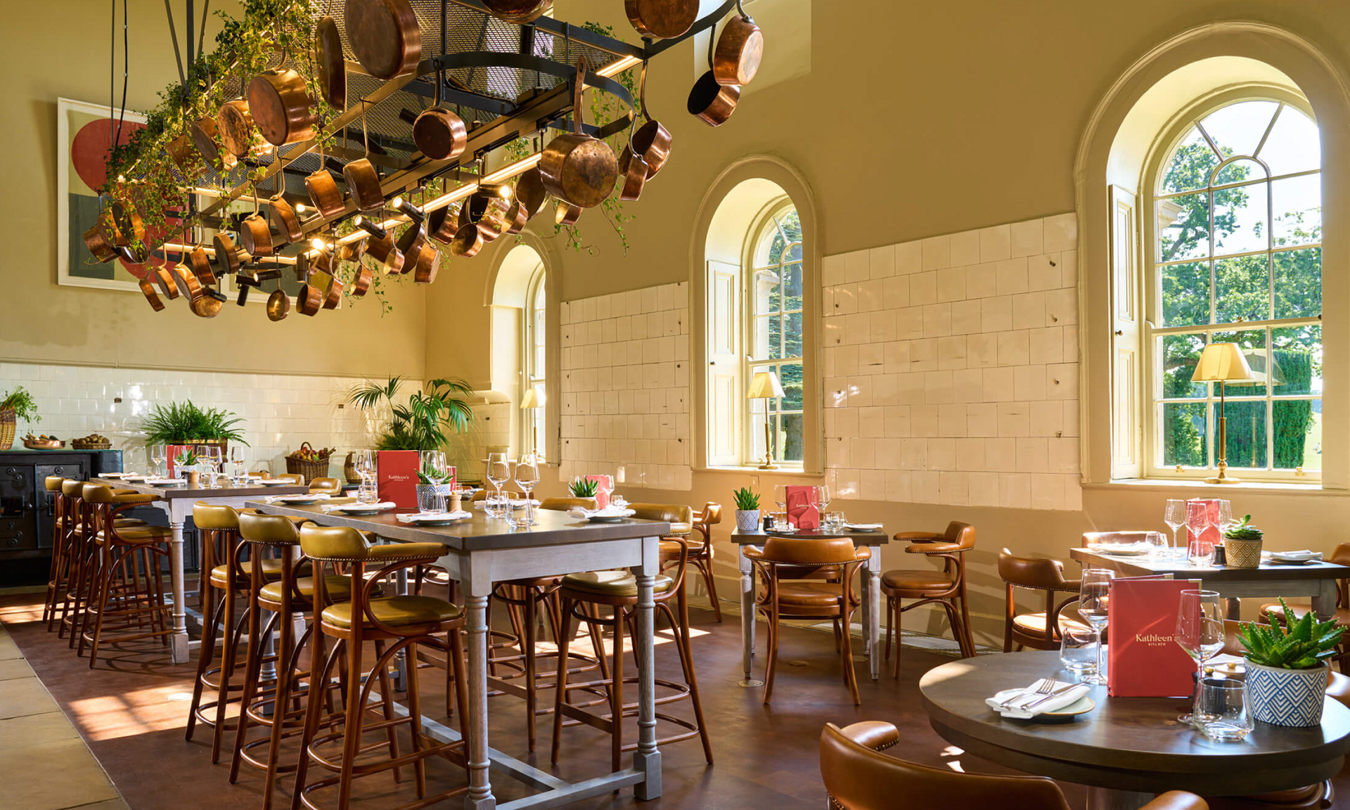
Located in the old servant’s kitchens of Carton House, Kathleen’s Kitchen is a contemporary, luxury take on traditional culinary practices. When building out this new branding scheme, we dug deep into the vast history of this storied great
house. In order to effectively cut through a busy hospitality space, and create a dining destination of originality and soul, we drew inspiration from the past while placing the restaurant firmly in the present.
Bringing the Tradition to Life
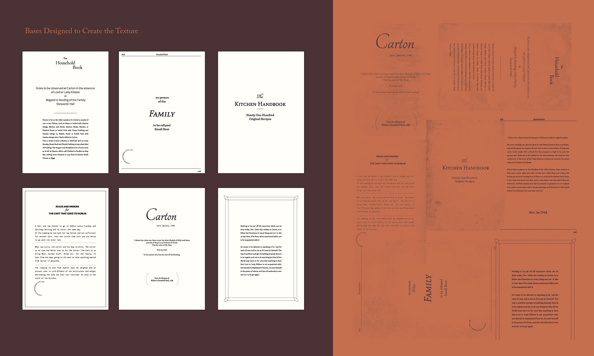
The identity for this brand was inspired by the original Marquis of Kildare’s Household Book from 1758, which contained rules and regulations for running the household and servants kitchens.
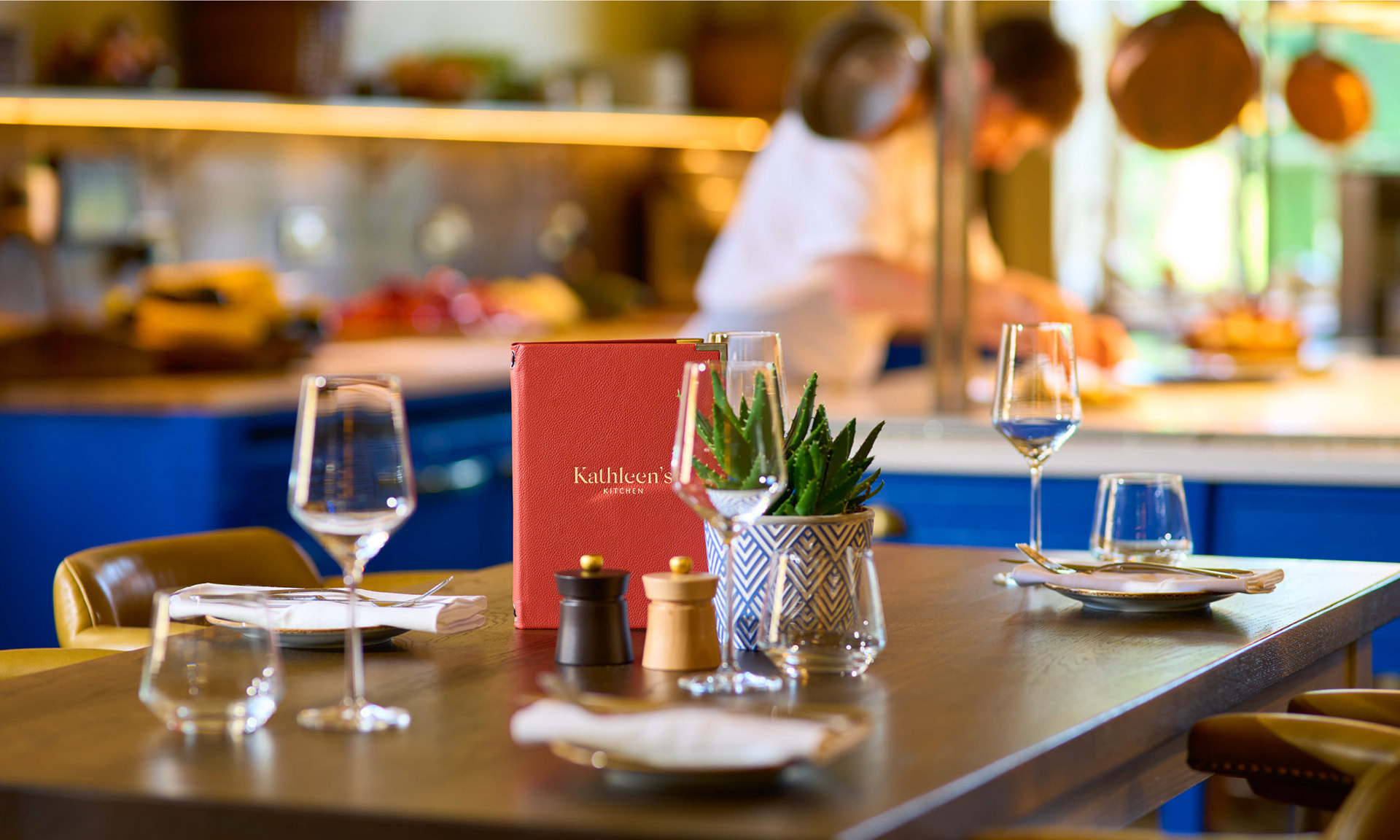
The logotype is a combination of Silk (Kathleen's) and Goudy Old Style (Kitchen). We used Silk because it is a delicate font that emulates a feather pen's script. We notice in its design that the letters are high contrast in shape.
These characteristics communicate a heritage feel to a contemporary audience. The font name, Silk, also resonated greatly with the venue – being a sub-brand of a luxury five-star resort. Also, silk, as a material, evokes premium references and conjures notions of luxury, connecting it thoroughly to the parent brand.


Goudy Old Style was designed in 1915. Goudy said he was initially inspired by the cap lettering on a Renaissance painting, but most of the flavour of this design reflects Goudy's own individualistic style. It is robust in comparison to Silk and works perfectly supporting the name “Kathleen's”. And, paired alongside Silk, the juxtaposition only enhances the visual impact of the brand's name.
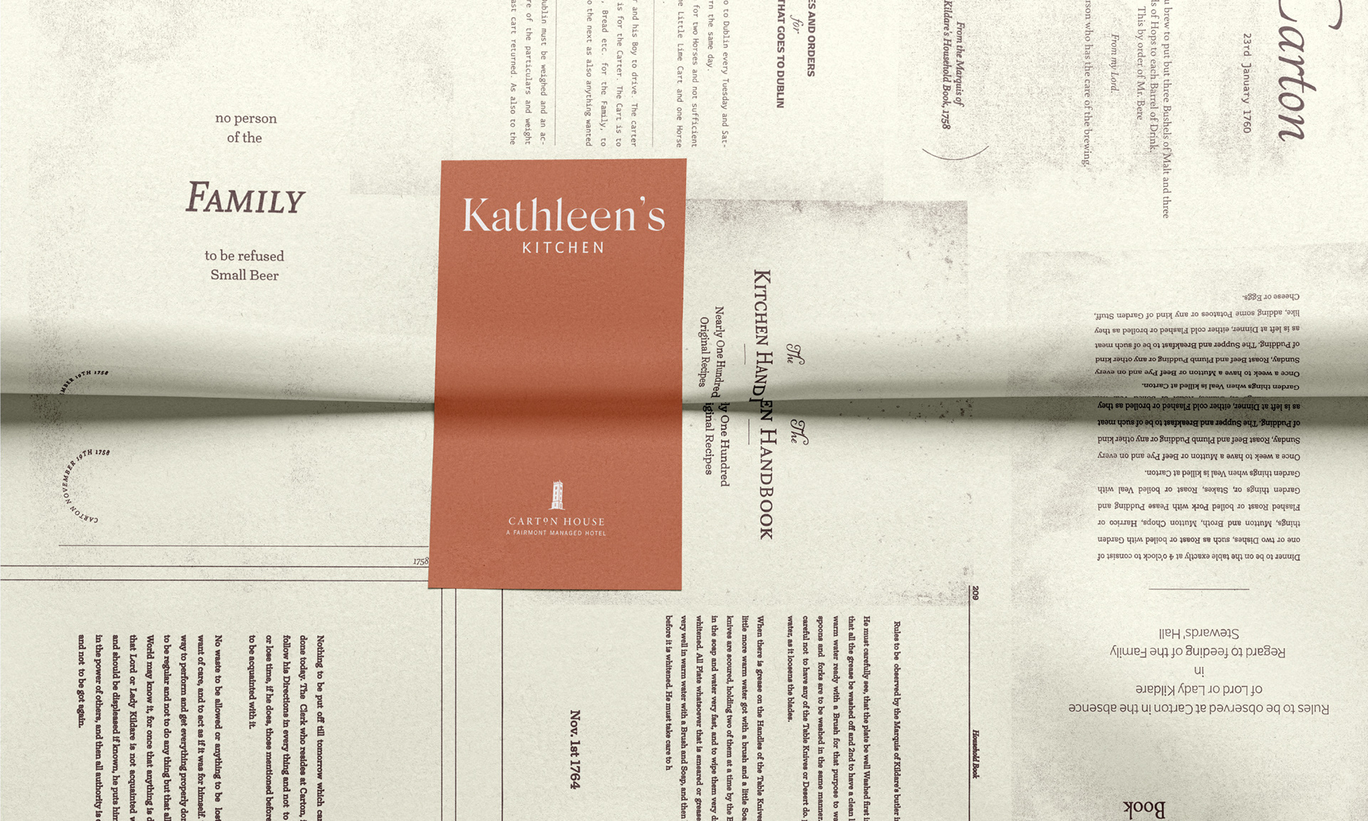
The colour palette was chosen to match the environment. We wanted a heritage-style colour to represent the vintage aspects of the kitchen – one which would give a classic touch and communicate a premium feel, and, we chose an orange hue to contrast the brown.
Headlines and copy elements from the original household book were used to simulate old well-worn pages seen across menus and brand applications, creating an authentic and vintage experience for all those visiting Kathleen’s Kitchen.
Bringing to life the brand through a series of activations was instrumental in order to take the antiquated essence of the dining destination and firmly root it in the present day. From Kraft takeaway coffee cups and paper bags to the menus and beeswax wrap used to present artisanal goods, the heritage of this space is seen in every touch.
By harnessing the history of Carton House’s culinary prowess and feeding that into creative design and execution we brought to life a timeless dining destination that combines both old and new.